quick & go
Delivery Company
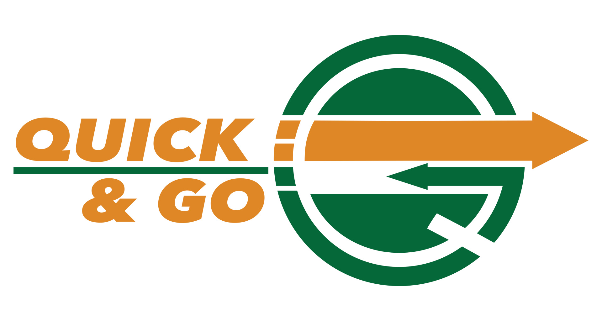
For this project, I created the brand identity for Quick & Go, a delivery company focused on efficiency and reliability.
The logo combines a green circle and an orange arrow — the green evokes the “go” signal from traffic lights, representing motion and
progress, while the orange arrow communicates precision and speed. The typeface was designed to complement the logo’s dynamic character,
giving the brand a cohesive and energetic look.
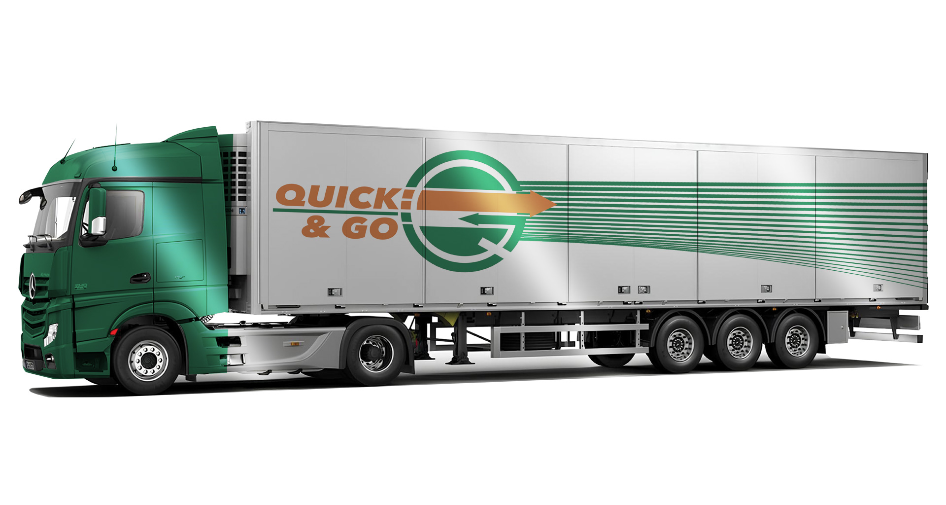
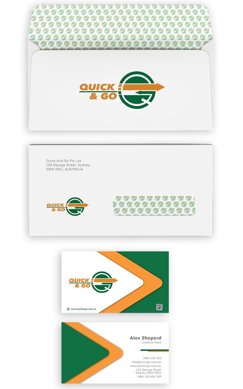
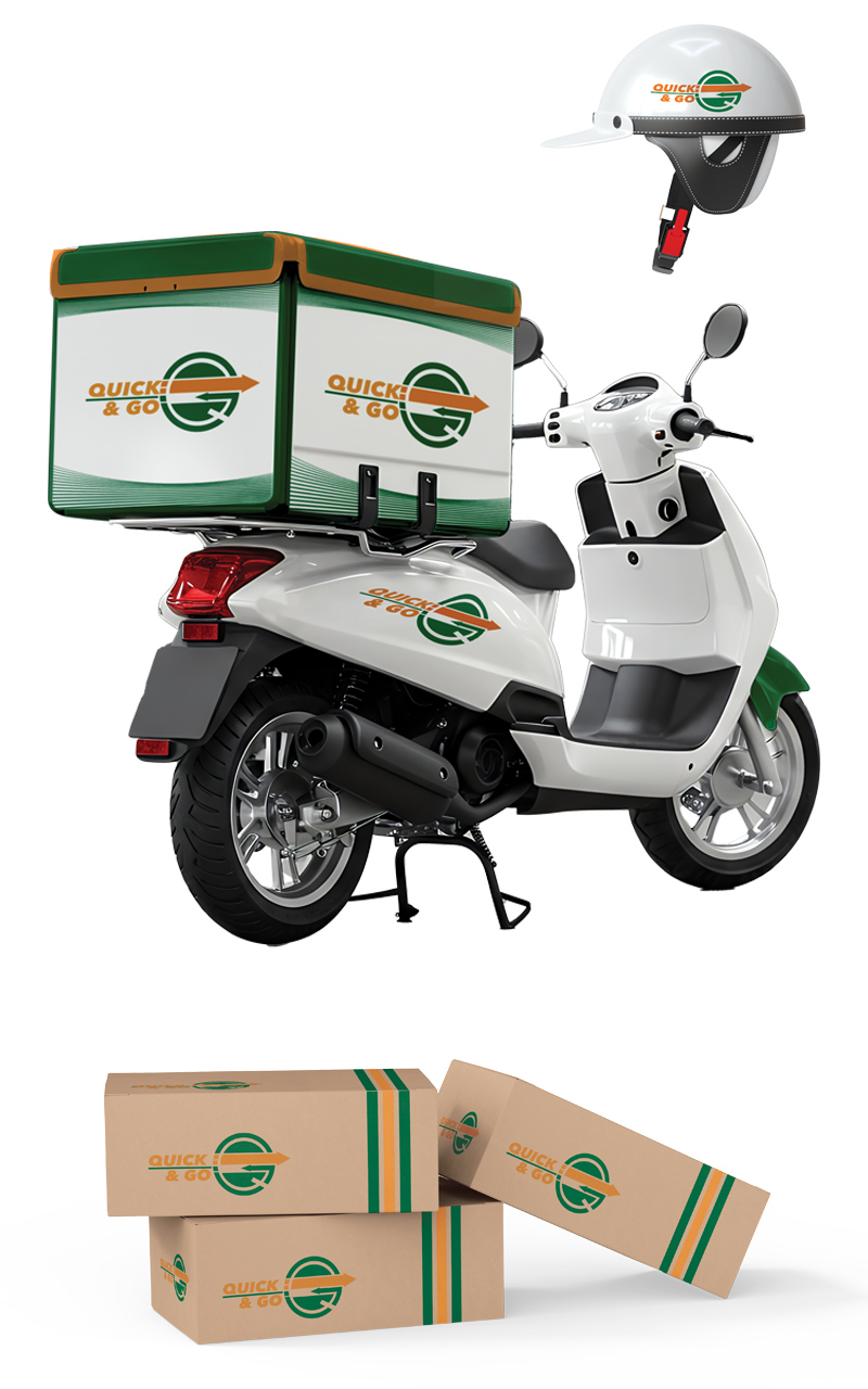
The full identity system includes branded stationery and business cards, all presented in mockups to demonstrate how the design functions
in real-world applications.

